Hijau

Mention Singapore and chances are the conversation that follows will find its way to food.

A tropical island known for its rich spices and delicacies, Singapore’s food scene is unmatched on flavour and variety.
The founders of Hijau envisioned a F&B concept that champions healthy eating without losing the richness of Singaporean cuisine.

The visual identity we devised complements the variety of colours and textures in each bowl, reinforcing the idea that there is lush beauty in nature.

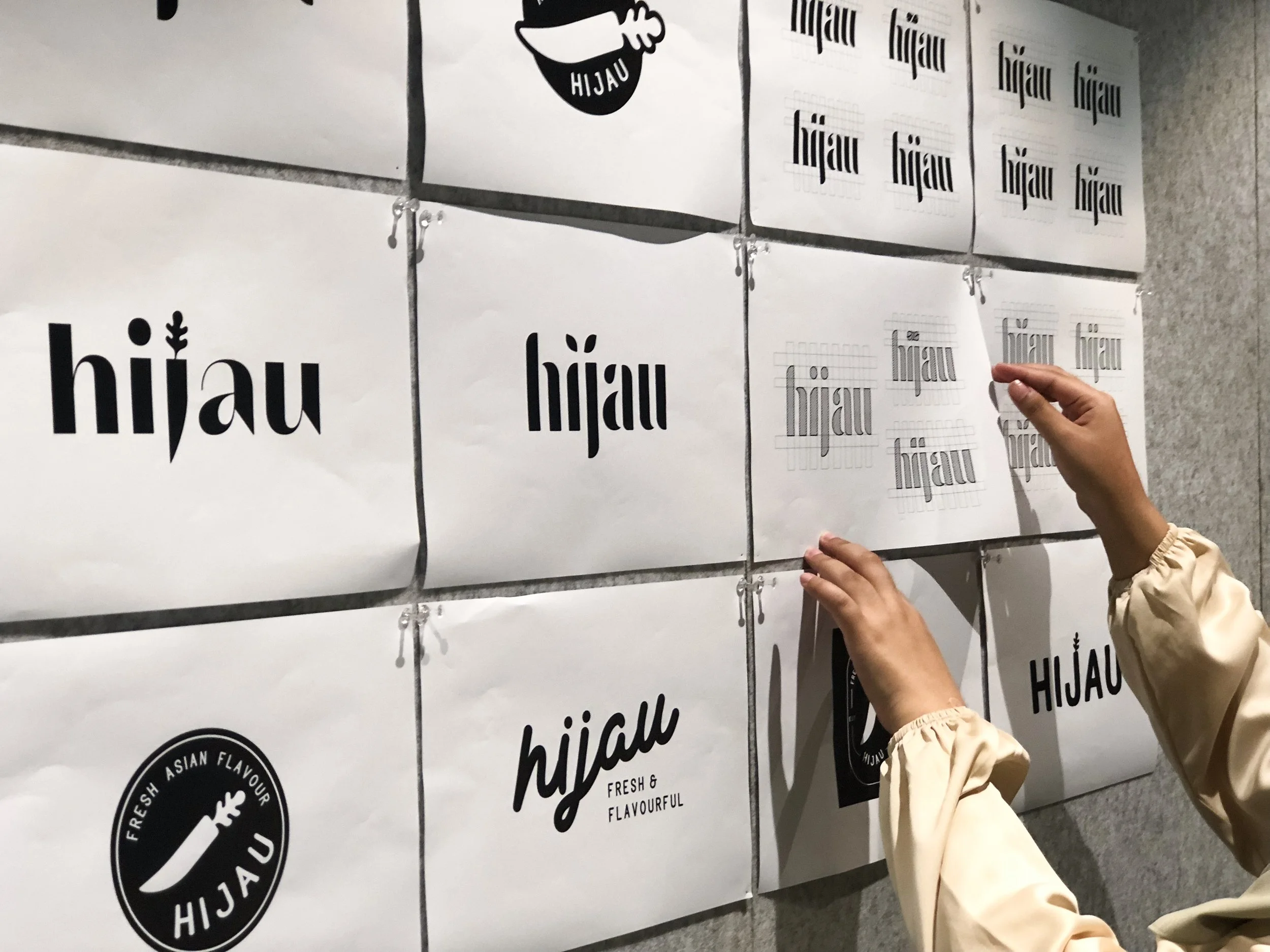
To create a brand with presence and substance, we explored different names to convey healthy eating. The team decided on the word Hijau which stands for the colour green in the Malay language. Hijau unifies the brands’ mission for healthy eating with its local roots, connecting people to a refreshing lifestyle within reach.

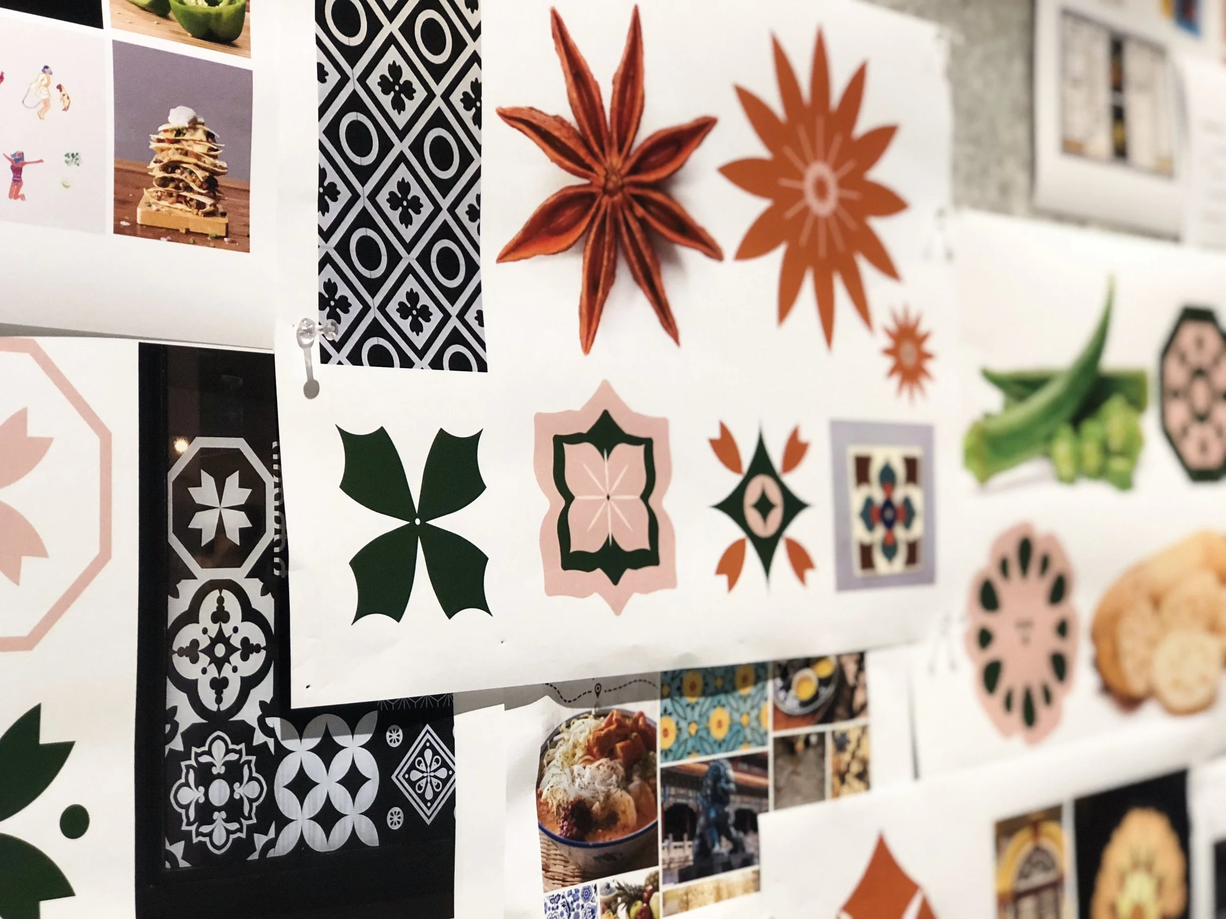
The identity system flourishes with ornate icons, each individually hand-drawn to come together and tell a bigger story. We kept to muted, earthy tones to contrast the medley of colour in each bowl.

Starting with the characters in our custom wordmark, we built a proprietary typeface of stencil-cut characters, with select distinctive leaf drops.


We rounded out the personality of the Hijau brand with a youthful voice and optimistic tone. For those seeking a healthier lifestyle, Hijau provides an opportunity to satiate desires while upholding an eco-conscious ethos.


Hijau is primarily a sensory experience of flavours. Each bowl is a celebration of commitment to honest ingredients, local culture, and good health.

Non-pretentious and culturally-rooted, Hijau provides healthier dining options without compromising the flavours that define the Singaporean palette.

