Orishi
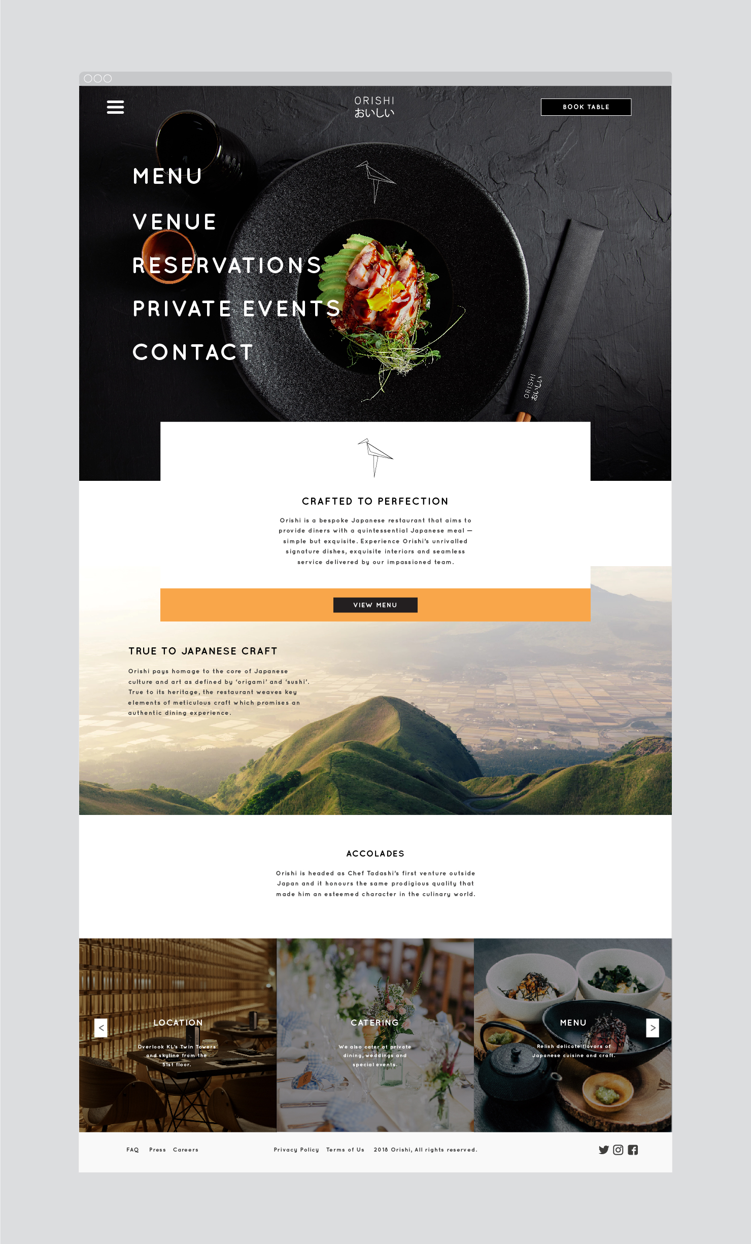
Branding concept and communication materials for a fine-dining Japanese restaurant in Kuala Lumpur, Malaysia.

Orishi, an upscale Japanese restaurant in Kuala Lumpur, provides culinary delight in a bespoke setting.

We derived the name Orishi from origami and sushi to emphasise the delicate balance of craft in food styling — encapsulating Japanese dining at its finest.


In Japanese culture, the crane represents longevity and is a harbinger of grace. The crane motif summarises the brand’s visual strategy to express tranquility and balance.


The interiors feature a melange of Japanese influences: earthy forms and tactile textures all accentuated by warm lighting.

By using solid black — a colour that carries strong symbolism in Japan — alongside a limited, primarily monochromatic colour palette, we created a system that shines as a bold, modern take on Japanese dining.

The floorplan layout lends the restaurant a quiet demeanor with little distraction, establishing intimacy and heightened appreciation of the food.


The result is a brand identity that resonates with the dining experience, draws distinction through a minimalist aesthetic, and is complemented with key online and offline assets.


